"Colour is the emotional language of a space. The right palette doesn't just look beautiful it makes you feel exactly how a home should make you feel."

Of all the decisions involved in designing a home, few feel as paralysing as choosing a colour palette. The options are seemingly endless, the stakes feel high, and the fear of getting it wrong can cause even the most decisive people to freeze. At Entrust, colour selection is one of our most requested areas of expertise, and we've developed a clear, systematic process for helping our clients choose palettes they will love for years not just months.
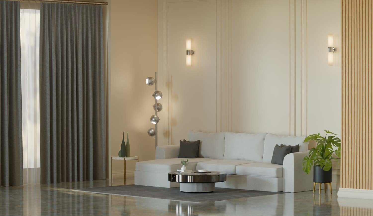
Before you fall in love with a particular shade at the paint store, understand this fundamental truth: colour looks different in every space depending on its light conditions. A warm white will look yellow in a south-facing room flooded with afternoon sun, and grey in a north-facing room with cool, indirect light. Entrust always conducts a light assessment before recommending any colours we look at the orientation of the space, the quality and direction of natural light at different times of day, and the colour temperature of existing artificial lighting. We then test large paint samples (at least A3 size) on the actual walls before committing.

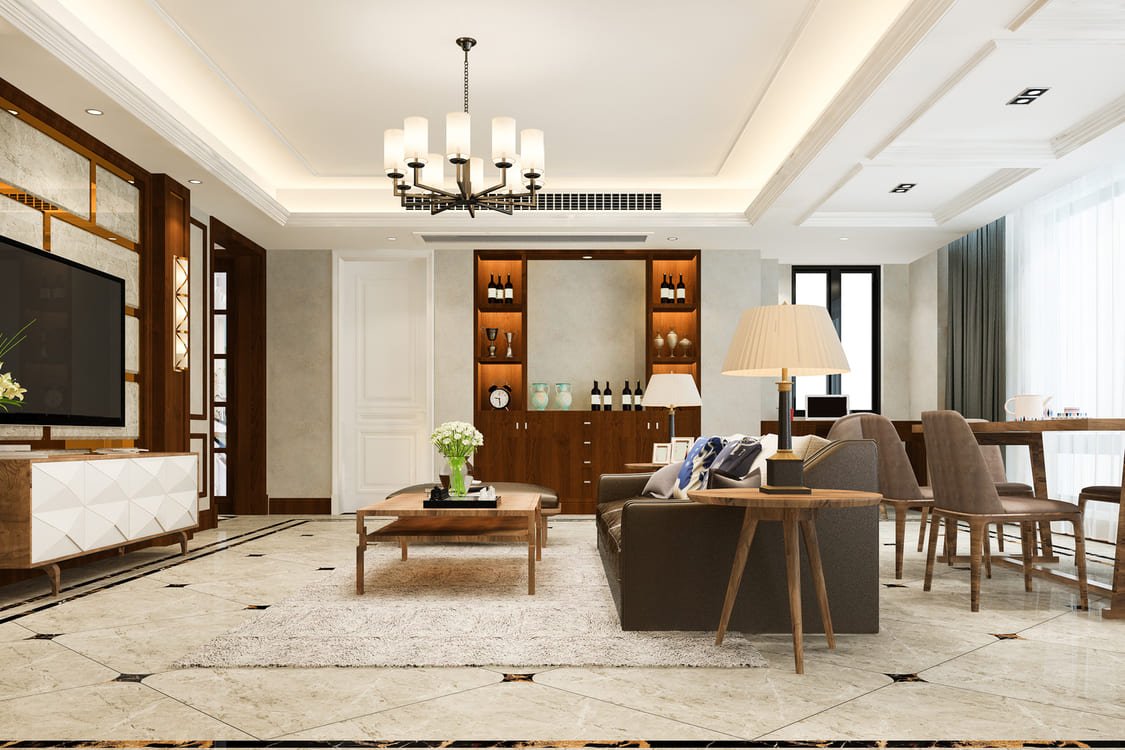
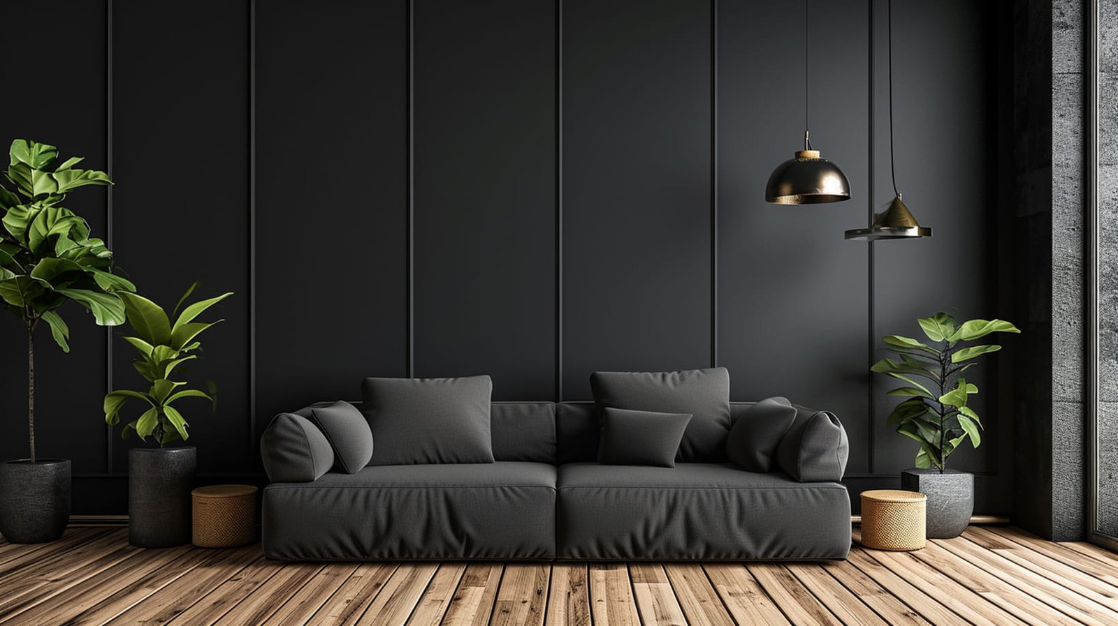
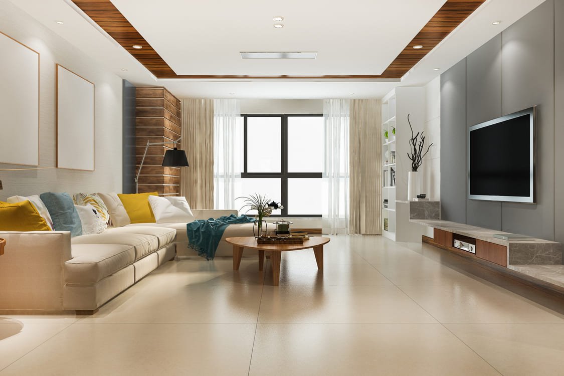
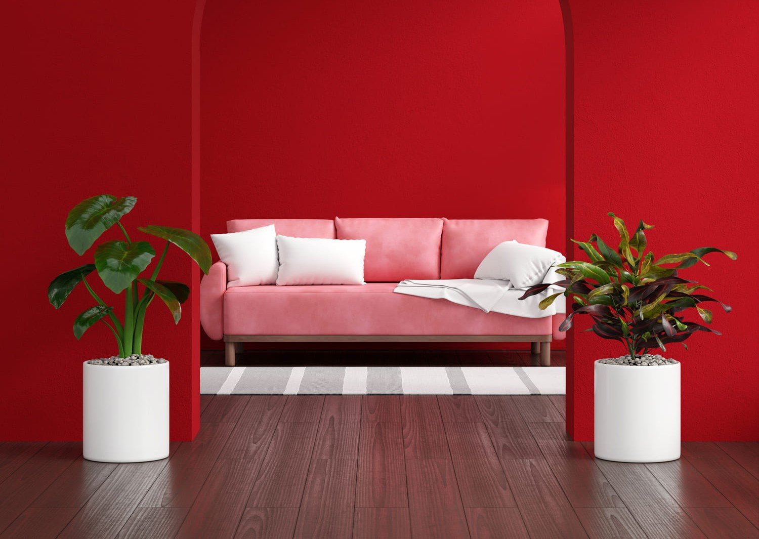
The 60-30-10 rule is a foundational principle in interior colour design, and it remains one of the most reliable guides available. The dominant colour (60%) is typically a neutral applied to walls and large upholstery pieces. The secondary colour (30%) is used in curtains, rugs, accent furniture, and joinery. The accent colour (10%) is reserved for cushions, artwork, vases, and small decorative objects it is the colour that adds punch and personality. This hierarchy prevents any single colour from overwhelming the space while ensuring visual coherence across the room.
The most common reason colour schemes feel "off" is clashing undertones. Every paint colour carries a subtle undertone warm (red, orange, yellow) or cool (blue, green, purple). When you mix colours with conflicting undertones without intention, the result feels visually unsettled. At Entrust, we select colours that share compatible undertone families, ensuring that even contrasting colours within a palette feel like they belong together. For example, a warm white wall pairs beautifully with a warm sage green accent, while a cool white works better alongside dusty blue or slate grey.

"Colour is the emotional language of a space. The right palette doesn't just look beautiful it makes you feel exactly how a home should make you feel."
Entrust Design Team
While each room in your home can have its own distinct character, there should be a unifying thread of colour that creates a sense of flow when moving between spaces. This is typically achieved by using the same neutral throughout all corridors and transitional spaces, and allowing individual rooms to express their personality through secondary and accent colour choices. Entrust designs colour journeys for entire homes ensuring that the transition from hallway to living room to kitchen to bedroom feels considered and cohesive, rather than like a series of unrelated spaces.